

Que es Flexbox?
Flexbox es un nuevo módulo de diseño en CSS3 para mejorar la forma en que hacemos Responsive Design, evitando así el uso de float (No uses float para hacer responsive design). Gracias a FlexBox facilitamos la forma en que posicionamos elementos, es más simple y usamos menos código.

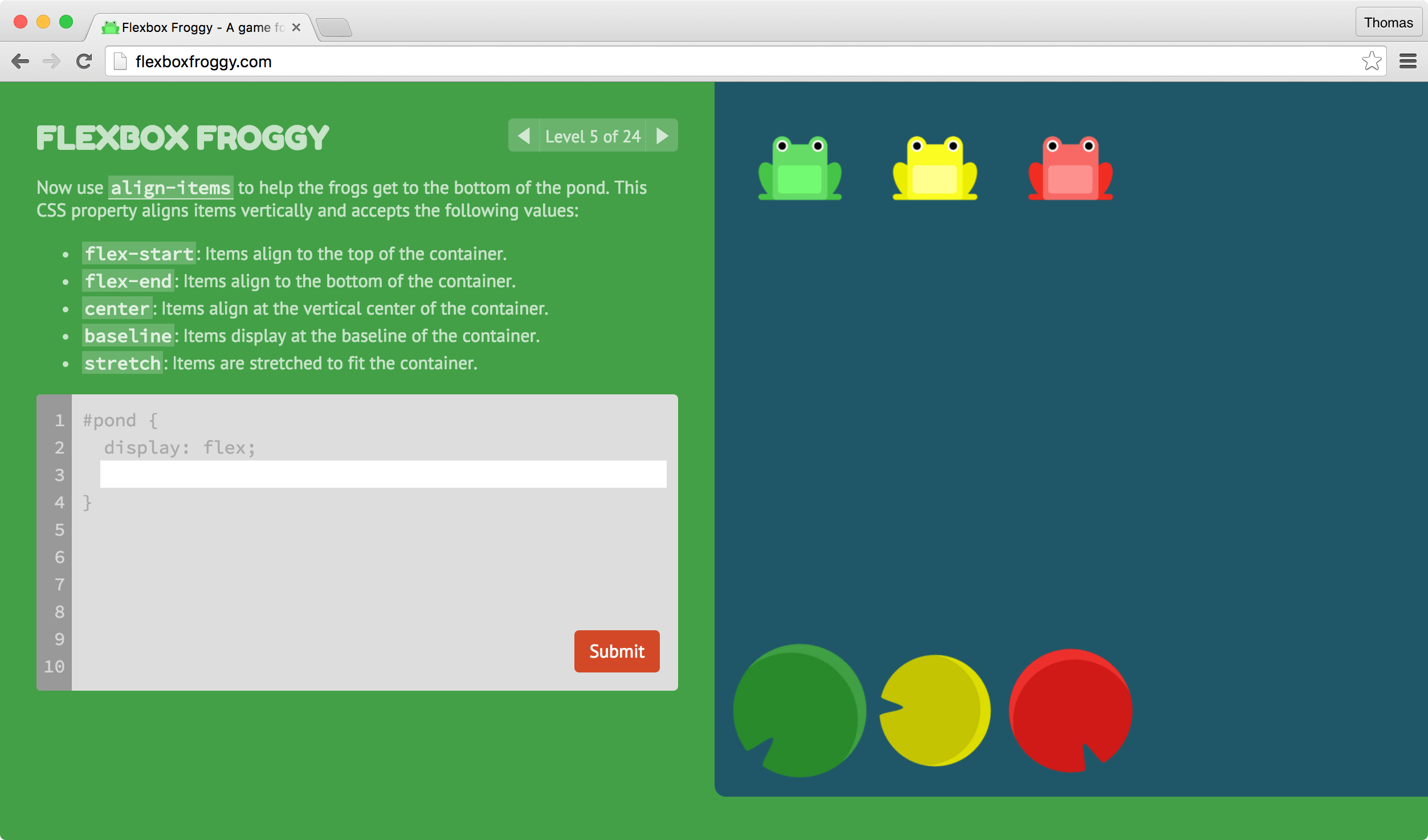
Revisando FB encontre este enlace http://flexboxfroggy.com/ un excelente juego para aprender a trabajar con flexbox.
Welcome to Flexbox Froggy, a game where you help Froggy and friends by writing CSS code! Guide this frog to the lilypad on the right by using the justify-content property, which aligns items horizontally and accepts the following values:
- flex-start: Items align to the left side of the container.
- flex-end: Items align to the right side of the container.
- center: Items align at the center of the container.
- space-between: Items display with equal spacing between them.
- space-around: Items display with equal spacing around them.
Lectura recomendada:
El gran poder de CSS3: FlexBox Flexbox CSS
Imágenes:
- envato.com
- luiscarlospando.net
- thomaspark.co
- filisantillan.com