The truth is that the digital age has its pros and cons. As pros we can obviously count the speed with which the information is distributed and how easy it can be read by anyone, but when we look at the cons, it is very easy to create news that seems real and distribute them. It here where we can perform a couple of verifications to check if a new is real or not, and what better way to explain it than with an example … lets go!

Context

A few days ago my mother-in-law sent a link for a natural medicine that seemed to have everything she needed, and she asked us what we thought about it and if we could buy it.

Suspicious Links

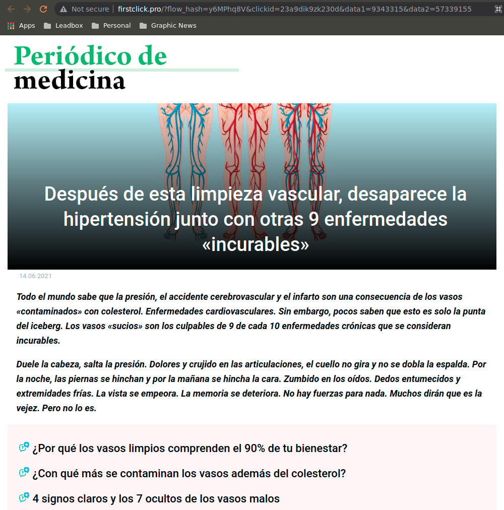
First thing we saw is that this link was obviously not coming from any known news portal, it doesn’t even has a name to make us believe such a thing. And not just that, if we click on the link itself, it gives us a 404 error, so they didn’t even put some effort into making a front-page.

Additionally, the logo of the so-called “newspaper” is also not clickable, which indicates that you can’t even see if they have any other articles. We realize immediately that this article was hand-made.

Finally we realize that the url includes a flow_hash that is nothing more than an algorithm for data collection, which sends a lot of your data for analysis once you click it and that they are probably monetizing this link (either charging for advertising or PPC)
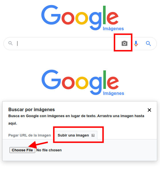
Fake Doctor

They speak about a certain Miguel Suarez, who is part of the Department of Vascular Surgery at the National University of Medicine. practicing neurosurgeon, honored physician from Colombia. And here we realize of the scam, because in the article they do not call him “Doctor” but “Sr” … Did you notice?

In addition to this, it should be noted that they added a fabulous photo of Mr. Suarez to get along with the article, but there is a very easy way to verify if this photo is actually from who they talk about. All we have to do is this:

  • Download the image by right clicking and saving to your computer.
  • Go to google.images and press the camera icon in the search box.
  • Add the picture and search.

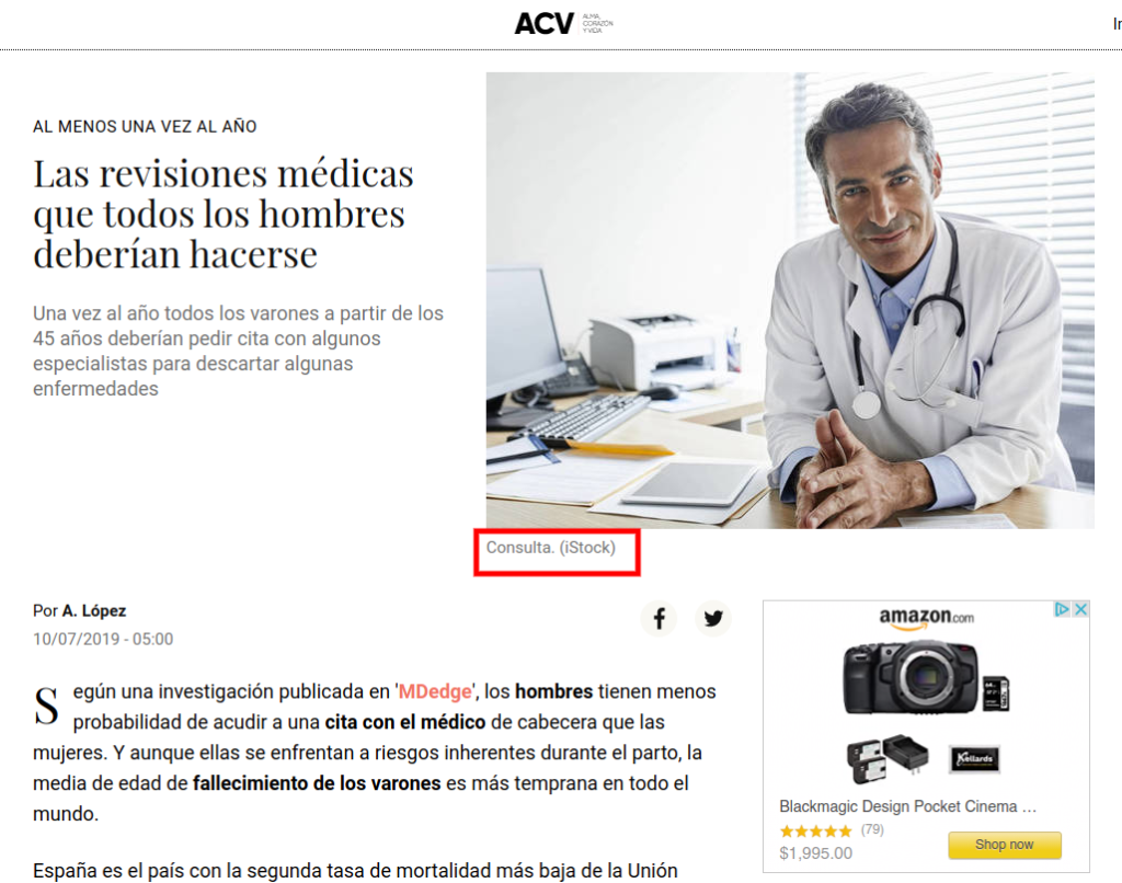
This will perform a search based on images and not on content where you can see which portals are using the same photo. The logical thing would be to find many photos of this Suarez in different articles endorsing the news of this new medicine, but truth is, we found anything related.

Instead, we found that this was a stock photo, a photo produced in a studio to be sold on gallery portals so that this content is used by people who do not have photos to fill their articles… It’s a Catfish.

At least one of the links where we verified the information had the decency to put that they got the pic from istock.

Special sell or single seller

Finally, to kill my curiosity, the article indicates that this medicine can only be purchased through this website since pharmacies stopped selling it due to its effectiveness. However, if you look for the product at mercadolibre (like ebay for LATAM), you realize that they also sell it there … BUT BEWARE … absolutely all sellers have the same photo of the product and there are no “real” photos of this product…

Of the 11 articles that offered this medicine, all were linked to only 3 sellers in total, all selling from the same location and almost with the same name… come on, if this were a revolutionary medicine, everyone would want to sell it. Right? Anyway, and to make the story short, when reviewing comments in detail we found the icing on the cake lost in a sea of false comments. “They sell counterfeit product.

Just out of curiosity I searched at mercadolibre different countries website (it’s country located), and this medicine didn’t even exist. I also asked pharmacies if they had ever sold it, and neither… Verdict… it’s a Scam.

The point of this article is not to discredit the medicine itself, if you consume it and it does you good, fabulous, leave me a comment and that’s it. But the topic here is that’s it’s awful to share information about miraculous medicines that surpass a real medical evaluation, offering themselves as salvation in the middle of a pandemic where many are looking for an angel in the middle of their journey.

Have you found links like this? Tell me about! now you now know how to verify if this is a real or fake news.


This post has a nicer formatting that can be seen at it's original source at tatica.org , so feel free to hit the link and read better version!

I’ve owned a TaoTronic TT-BH22 headphones with noise cancellation for a while ago, and I can tell you that despite being quite cheap have worked perfectly for me. Battery life is fantastic (around 40 hours) and noise cancelling, even if it’s not 100% perfect as the professional ones, is more than acceptable.

However, then I bought those I didn’t realize that they had an integrated microphone, and I think that during the first year of use I left this feature forgotten and unused since my SO didn’t recognized it right away. Sad thing is, it wasn’t until my husband tried them on his laptop and his SO recognized the microphone, that we knew about this.

And even sadder than that? We both use the same SO… so it was time to work around this and figure out why it was working on his laptop and not on mine, so if anyone has encountered an issue like this, here’s a solution that should work with every headphone with a built in microphone just like mine.

All problem was this: Like this headphones have a high fidelity sound  (Hi-Fi)  my system didn’t recognized them as regular headphones and “assumed” they didn’t had a microphone, that was it…

Now it was just time to configure correctly the headphone type, however, KDE’s Bluetooth config app is too simple and doesn’t allow more advanced settings, so I installed blueman, which is Gnome’s Bluetooth settings app and allowed me to configure easily my little gadget without going to the terminal. So lets install blueman as root:

[root@libro ]# dnf -y install blueman

And with this app we can configure our Bluetooth devices better. when we open the app the first thing we see is the list of recent devices.

  • We will locate our headphones on this list and right-click it to see the menu.
  • Will select the option “audio profile” .
  • And finally select the option Headset Head Unit (HSP/HFP).

And that’s it, you should be able to see your microphone between the audio device list and select it.

Now this happy girl can walk around the house while makes herself a coffee in between the million meetings we have now during this pandemic.

Let me know if this worked for you, and specially, which headphones did you configured so I can add them to this list.

  • TaoTronics TT-BH22

This post has a nicer formatting that can be seen at it's original source at tatica.org , so feel free to hit the link and read better version!

When we are creating a book that will be published at Amazon Kindle Store and we want it to be printed as well as digital, we need to have some important considerations when comes to create the cover.

It’s not just about having an attractive cover that encourage readers to buy, but it also has to be functional when comes to content, paper type and even the thickness of the book itself. Anyway, the idea is to have a working cover that won’t ve rejected by the automated verification process that Amazon holds.

When comes to select our book properties, we not just have a wide sizes variety, but also we have to decide is it will be printed on black/white or color. Besides, we will have to choose the thickness and quality of the paper, so we can begin to estimate the size and cost of our book.

For this example, we will assume we are creating a cover for a 6″x 9″ (15.24 x 22.86 cm) book

The most important when comes to create a book cover are the dimensions, since it won’t matter to have a fantastic cover that crops, is unreadable or is misplaced and not aligned correctly. This is why we will use an online service that will help us run the necessary calculus to save time and effort:

Lets asume we have a 100 pages book, and we will use a White paper for color impressions.

This type of paper has a thickness of 0.002347″ (0.00596138cm)

This web allows us to play with several options that include pre-formats to start writing our books, generate the ISBN bar code, but the option we really need is the KDP Cover Template Generator. So click on it

On this form, we will have to fill the data requested on each field just as follows:

  • Width: 6
  • Height: 9
  • Page count: 100
  • Paper type: select white colour
  • OPTIONAL ISBN-13:Leave this in blank
  • OPTIONAL Price Barcode: Just leave this in blank
  • Formats: Select the ones that I put on bold, which are usually already marked
    • PDF
    • PNG
    • IDML (InDesign)
    • SLA (Scribus)
    • ODG (OpenOffice)
  • Your email address : hi@gmail.com
  • Your email address (again): hi@gmail.com
  • Consent to email: Check this last field to consent that you want them to send you an email.

Finally click on the “Email Cover Template” button and this will display a popup with the option to leave a donation. Remember to always leave a tip if you can since this services don’t have funds beyond their own users.

If you can’t make a donation, then simply select the first option that says “No thanks, just email me the template” .

Either you make a donation or not, you will finish the process with this donation page again, but this time with a success message that ask you to check your email and download your guides. Just do so and download either the png or pdf with the desired layout. I’m gonna open it with inkscape to start designing my cover.

We add the image with our layout to inkscape and adjust the size of the canva to the one at the image (the outside). This will allow our design to already include the cut margins or bleeds that always give us a headache.

We will design our cover following the guide lines and respecting the margins, only writing our content on the white parts of the layout. We will include our title, images, description but remember to leave the space for the ISBN since Amazon will add it automatically in case you don’t have one.

It’s important to mention that the section we usually forget is the name at the book mold. Make sure that this text is within the white line at the very center of the layout without touching the red border so it pass the Amazon KDP filters.

To work more comfortably, I set the layout image to a 60% opacity and put it on top of everything, that way I was able to see every element below the layout and move them better. But this is just a personal recommendation.

Once happy with your design, just delete the layout image, export your cover at 300DPI and you will be set to upload it at Amazon KDP.

Let me know if this tutorial was useful and if you created your book cover easily with this tips!


This post has a nicer formatting that can be seen at it's original source at tatica.org , so feel free to hit the link and read better version!

This days I had to send a multiple page PDF with a bunch of pictures on it, but requirements said that it needed to be smaller than 5Mb. With Ghostscript I was able to transform a 10.9MB file into a 1.2Mb without loosing quality, since it was mandatory that the small letters contained on the PDF were completely readable.

To work with ghostscript first you need to install it:

[tatica@libro ]$ sudo su –

[root@libro ]$ dnf -y install ghostscript

Then we exit the root mode and locate at the folder where we have the file, in my case:

[root@libro ]$ exit

[tatica@libro ]$ cd /home/tatica/Documentos/archivo-maestro.pdf

To run ghostscript let me first explain you the options you can choose, and what you can archive with each one of them:

/prepress (default) Higher quality output (300 dpi) but bigger size

/ebook Medium quality output (150 dpi) with moderate output file size

/screen Lower quality output (72 dpi) but smallest possible output file size

In my case, I want the file to be compress, but not to loose quality, so I ran my script with the ebook option:

gs -sDEVICE=pdfwrite -dCompatibilityLevel=1.4 -dPDFSETTINGS=/ebook -dNOPAUSE -dQU
IET -dBATCH -sOutputFile=archivo-resultante.pdf archivo-maestro.pdf

and that’s it. Remember that the output file comes first, and the file you want to convert comes at last (I know, tricky). If you used it, let me know how did that work for you!


This post has a nicer formatting that can be seen at it's original source at tatica.org , so feel free to hit the link and read better version!

A couple of friends were curious about how I did my ghost picture for my recent project. Just in case you have no idea what I’m talking, I started a small photo-project to explore light and shadows and as usual, tell stories… long time I didn’t do it, right?

I tried to record it 2 times with Gnome’s desktop recorder but kept failing (I was an avid user of recordmydesktop), so finally on my 3rd attempt I used SimpleScreenRecorder which ended up being super easy to use, and not lagy at all. Since I got the recording on the 3rd time, this is not the picture I posted (probably better after so much damn practice, but who cares), so if you see differences between both, now you know the reason.

Here’s the TimeLapse video of the edit because I doubt you want to see 39mins of me cleaning sky and fabrics with a mouse, however, since I know people might get bored, below the video you will find a list of some of the parameters I used for the full edit.

After selecting the images that would help me archive the final output I started the editing. I used darktable for the pre-processing and get the main black/white images. For most images I used pretty much the same modules (a few adjusts here and there to exposure since was working with 100% natural light):

  • Monochrome Module: Just because I like to have a base sample of the monochrome version.
  • Filmic
    • Middle Gray Luminance: 9.13%
    • White Relative Exposure: 2.81 EV
    • Black Relative Exposure: -7.98 EV
    • Contrast: 1.574
    • Shadows & Highlights: 2.25%
  • Equalizer (Check Video)
  • And a bit of Highpass to help my old camera (Check Video)

Once that was done, copied the style to the rest of the pics and ended up with several images to play.

It’s mostly play with each image until you get the result you want. The GIMP process is hard to explain through steps, but there are a couple of tricks that I think are important to follow while doing this kind of edits:

  • Work with mask layers… If you use just the eraser, you will end up deleting things that you might need later. So use masks, own them… love them…
  • When come to fabric borders, use the curve and fine tune them easily.
  • Merging fabric isn’t easy and takes time. There’s no magic formula.

So for the editing part you will definitely will have to check the video and enjoy the 39min -to- 5min cut :)


This post has a nicer formatting that can be seen at it's original source at tatica.org , so feel free to hit the link and read better version!

Yo era una ávida usuaria de los módulos de Enfoque y reducción de Ruido raw antes del LGM, pero los chicos fueron lo suficientemente amables para enseñarme otra forma de obtener mi enfoque, y como tiendo a olvidar las cosas, acá les dejo mis notas.

Módulo de enfoque

Tal como su nombre lo indica, esta es quizás la forma más fácil de agregar extra definición a tus imágenes al mejorar el contraste de los bordes. No es el módulo mas poderoso ya que cuando quieres incrementar mucho los valores para obtener una mejor definición, trae consigo una cantidad enorme de ruido que luego tienes que tratar con módulos adicionales. Cada imagen necesita un juego de parámetros distintos, pero me he sentido bastante cómoda con los siguientes valores:

Radio: 3.2
Cantidad: 1.1

Dependiendo de la cantidad de detalle (o ruido) que obtenga en la imagen final, me gusta agregar un 10 al umbral o algo cercano si es necesario, o ir directo con el módulo de Reducción de ruido RAW con valores pequeños cercanos al 0.003.

Módulo Ecualizador:

Acá viene el truco. Trabajo solo en luma para obtener el resultado que quiero, el cual es incrementar la definición de los bordes, obtener un poco de reducción de ruido (solo un poco porque los ajustes son muy fuertes para trabajarlos en el Ecualizador) y agregar un pequeño efecto de quemado en ciertas areas (trabajo mayormente con retratos).

Para obtener el enfoque incremento la curva en el lado fino (derecho) unos dos niveles.
Para la reducción de ruido incremento el marcador inferior del mismo lado fino. Casi no se ve, pero ahí está… no lo suban mucho.
Para el efecto de quemado (bajar la claridad) bajo medio nivel el segundo marcador en el lado grueso (izquierdo)

Puedes ver un mejor resultado en el enfoque, y un bonito efecto de quemado sobre el borde del hombro y la sombra de la clavícula.

Paso alto:

Este es quizás tan fácil como el módulo de enfoque, pero con algunas diferencias y un poco más de control. Es mucho mas definido y es mas fácil predecir el resultado final al ver la definición de bordes y ajustar el radio de desenfoque, o intensidad. Recuerda que luego de aplicar tus parámetros, debes aplicar el modo de mezcla a Luz suave para poder ver el resultado final y no solo la mascara con la salida de los bordes. En mi caso particular, me siento cómoda trabajando con estos números cuando se trata de piel:

enfoque: 25%
mejora del contraste: 35%
opacidad de la máscara: 80%

Mi flujo de trabajo personal para trabajar con piel ahora incluye trabajar tanto con el módulo ecualizador como con el módulo de paso alto, (si, me olvidé por completo del módulo de enfoque), pero cuando se trata de rostros, me gusta aplicar algunas máscaras parametricas al módulo de paso alto para definir distintos niveles de enfoque en la piel (los rostros son mas difíciles)

Acá esta el resultado final utilizando mi combo personal (ecualizador + paso alto). Espero que les resulte tan útil como a mi :)


This post has a nicer formatting that can be seen at it's original source at tatica.org , so feel free to hit the link and read better version!
La siguiente publicación surge porque muchas personas me han consultado, cómo hacer para que en los tuits que llevan imágenes incrustadas, les aparezca esta imagen y no un enlace como ocurre con muchas aplicaciones para programar tuits, por ejemplo Hootsuite. Cabe destacar que no tenemos nada en contra de estas aplicaciones, las hemos utilizado durante mucho tiempo y cumplen sus funciones de la mejor manera (si compran las versiones "pro" mejor aún), sólo que en este caso les voy a explicar como programar estos tuits desde la relativamente nueva opción de twitter, llamada "Twitter Ads", para que en sus tuits las imágenes aparezcan sin necesidad de abrir un enlace adicional.

Si es la primera vez que están entrando en esta sección, solicitará seleccionar un país y una zona horaria. En nuestro caso no existe la Zona Horaria de Venezuela, pero colocamos la más cercana la cual tiene solo media hora de diferencia. Esto es importante porque al momento de seleccionar la hora para publicar sus tuits deben tener bien especificado la hora de sus país.
Por alguna razón que en este momento desconozco (quizás alguna actualización), la barra de Twitter Ads no me presenta la opción de "Creatividades" que es la sección para programar los tuits, pero como todo tiene solución, solo deberán seguir (por ahora) los siguientes pasos:

1.- Seleccionar en el menú Estadísticas, la opción Eventos. En la barra de menú verán un enlace como este: https://ads.twitter.com/accounts/18ce540lehf/events

2.- Deberán eliminar la palabra "events" y colocar la palabra "tweets" (sin las comillas), el enlace se presentará ahora de la siguiente manera: https://ads.twitter.com/accounts/18ce540lehf/tweets

Listo, ya podrán programar sus tuits como les mostraré a continuación. Es importante que tengan en cuenta que cada usuario de twitter, tendrá un número asociado, por consiguiente los enlaces varían, resalté en color rojo el número que nos corresponde a nosotros para que lo tengan presente.

Al entrar en esta página, podrán comenzar a programar todos sus tuits de la siguiente manera:
1.- Hacer clic en el botón "Nuevo Tweet" (ángulo superior izquierdo de la página)
2.- En la ventana que se despliega escribir el Tuit de la manera tradicional, y seleccionar la camarita que presenta para colocar la imagen (al igual que en la pagina de twiiter)
3.- Seleccionar la opción "Programación" y en esta sección deberán seleccionar la fecha y la hora del (deben estar pendiente de la zona horario)
4.- Hacer clic en el botón "Tweet"
y Listo!!!!

Luego podrás consultar los tuits que hayas programado seleccionando en la 3ra pestaña, la opción "Tweets Programados", y en caso de querer Editar alguno también podrán hacerlo desde esta sección.


Si tienen algún comentario, opinión o sugerencia nos pueden escribir a consulta_friki@kioscofriki.com.ve 
Y recuerda, si esta información te ayudó y quieres colaborarnos económicamente puedes hacer tu donación aquí

En nuestra publicación anterior (Instalación: Fuentes Equivalentes a Arial y Times New Roman) les comentamos cómo es el procedimiento para instalar fuentes nuevas en tus sistema GNU/Linux y cuales son aquellas fuentes equivalentes a las fuentes de MS Windows como Arial, Times New Roman, entre otras. En esta oportunidad, les vamos a mencionar cuál es el paquete que deben instalar para tener las fuentes completas "Microsoft True Type Core Fonts". Las cuales incluye:
  • Andale Mono 
  • Arial Black 
  • Arial (Bold, Italic, Bold Italic) 
  • Comic Sans MS (Bold) 
  • Courier New (Bold, Italic, Bold Italic) 
  • Georgia (Bold, Italic, Bold Italic) 
  • Impact Times New Roman (Bold, Italic, Bold Italic) 
  • Trebuchet (Bold, Italic, Bold Italic) 
  • Verdana (Bold, Italic, Bold Italic) 
  • Webdings


Es tan sencillo como realizar la instalación del paquete msttcorefonts. Como les hemos comentado en otras publicaciones deben estar como SuperUsuario para realizar estas instalaciones, si tienen dudas del nombre exacto del paquete se recomienda primero hacer:

aptitude search nombre_paquete

Luego que ya sepamos el nombre exacto, procedemos a realizar la instalación

sudo aptitude install nombre_paquete

Recordándoles también, que estos comandos son usados cuando son sistemas basados en Debian. De esta manera tendrán instaladas estas fuentes en su sistema en caso de requerirlas, como por ejemplo, para la navegación web tener las fuentes instaladas.

Cualquier duda, comentario o información puedes escribirnos a consulta_friki@kioscofriki.com.ve 
Y recuerda, si esta información te ayudó y quieres colaborarnos económicamente puedes hacer tu donación aquí
Recientemente, nos solicitaron un documento siguiendo las Normas APA, como bien saben si en algún momento han tenido que realizar un trabajo/tesis para una institución/universidad, éste es uno de los requisitos de formato que por lo general solicitan. 

El detalle relevante en este caso, es que éstas normas establecen que debes usar fuentes privativas, por ejemplo, Times New Roman. Si estas trabajando bajo Software Libre, pudieras considerar que esto es un incoveniente, y es por ello que hoy te traemos la solución. Como hemos comentado otras veces en Software Libre, siempre o en la mayoria de los casos, encontrarás un equivalente a lo que necesitas y en este caso es la fuente Liberation

Liberation, es un conjunto de tipos de letra, que contiene fuentes compatibles a nivel métrico (espacio ocupado) con las más usadas en sistemas de ofimática de Microsoft, las cuales son:
✤ Liberation Sans (equivalente a Arial)
✤ Liberation Sans Narrow (equivalente a Arial Narrow)
✤ Liberation Serif (equivalente a Times New Roman)
✤ Liberation Mono (equivalente a Courier New)
La primera distribución en incluirla fue Fedora (desde su versión 9), luego otras distribuciones de GNU/Linux: Ubuntu, OpenSUSE5 y Mandriva Linux, también la incluyeron de forma predeterminada en sus instalaciones y tanto OpenOffice.org, como su derivado LibreOffice también la distribuyen en sus paquetes de instalación, para todos los sistemas operativos que soportan.

En caso que no la tengan instalada en su distribución (esta o cualquier otra fuente), pueden descargarla (en este caso desde aquí), descomprimir el archivo, y tienen dos maneras sencillas de colocarla:
1.- Habilitar la vista de "archivos ocultos" (ctrl + h) → buscar la carpeta .fonts → pegar allí el archivo .ttf descargado de cada fuente (NOTA: con esta acción la tendrás habilitada, solo en la sesión donde se haya colocado).
2.- En algunas distribuciones como en ubuntu (si tienen instalada la aplicación), con hacer doble clic en la fuente tienen la opción de darle al botón "Instalar Tipografia" y listo!
Es importante que sepan que si las van a usar en Libreoffice (o en cualquier aplicación), deben cerrarla completamente para que pueda habilitarse, es decir, al abrir la aplicación la próxima vez la tendrán disponible.

Cabe destacar, que también existe el paquete para instalar las fuentes privativas y lo hablaremos en una próxima publicación, pero para todos aquellos que preferimos evitar dentro de lo posible, la instalación de este tipo de aplicaciones, esta es una manera super sencilla de solucionar el asunto.

Cualquier duda, comentario o información puedes escribirnos a consulta_friki@kioscofriki.com.ve
Y recuerda, si esta información te ayudó y quieres colaborarnos económicamente puedes hacer tu donación aquí